I had a number of prospective titles dreamed up for this post, including:
- I fought the StackPanel and the StackPanel won
- StackPanel: you keep using that word. I do not think it means what you think it means
- Why the !@#$ isn’t my TextBox scrollbar appearing?
- Everytime you use a StackPanel the CLR drowns a kitten
- Pure evil and StackPanels: BFFs
In the end, I decided to curb my hatred for this loathesome WPF control, and simply continue along the same vein as my previous WPF newbie post. After all, StackPanels don’t really kill kittens; VB programmers do. (joking! Unless there are no VB coders reading… ;) :P)
An innocent request
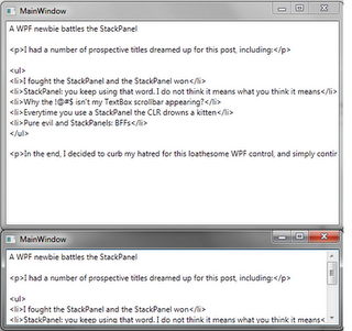
I only wanted to do something really simple. I didn’t think I was being at all demanding. I just wanted a TextBox with a scrollbar. This had always just worked for me before. To see what I mean, let’s start a new WPF project and create a new WPF Window XAML file. We’ll just whack in a TextBox with vertical scroll bar enabled and bask in the XAMLily glory of WPF:
<Window x:Class="WpfApplication1.MainWindow"
        xmlns="http://schemas.microsoft.com/winfx/2006/xaml/presentation"
        xmlns:x="http://schemas.microsoft.com/winfx/2006/xaml"
        Title="MainWindow" Height="350" Width="525">
    <TextBox VerticalScrollBarVisibility="Auto" AcceptsReturn="True" />
</Window>
You can see that as I resize the window, our TextBox resizes to fit the area, and the scrollbar appears as required.
Now we want to add a simple label on top. We don’t need a Grid for this right? We just want to stack a Label or TextBlock on top of our TextBox. Stack, huh? This handy StackPanel thing should be just what we need! There’s absolutely no way this will be able to waste the better part of our day…
The problem
<!-- Window cruft omitted -->
<StackPanel Orientation="Vertical">
    <TextBlock>Enter stuff in here:</TextBlock>
    <TextBox VerticalScrollBarVisibility="Auto" AcceptsReturn="True" />
</StackPanel>
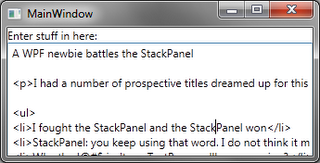
After running this the first thing we notice is that without text in it, our TextBox does not fill up all the remaining space in the window. When we paste in a chunk of text the box resizes to fit it in, but what happens when we try and resize the window? Hey, where’s our scrollbar?!?!
StackPanel size
I have read up a number of times on how WPF layout passes work. I have also promptly forgotten this information each time I’ve read it. So if you want to know the real reason for this behaviour then it would be a great idea to read up on this from a reliable source. If instead you want to get a vague idea from the ignoramous pounding dumbly away on the keyboard to bring you this post, then read on! :)
As I understand it the problem is the StackPanel (delightful little control that it is) is happy to expand indefinitely in whatever direction it is oriented. In the case of our vertically aligned panel, the child controls will fill out to the horizontal size of the StackPanel, but the StackPanel will not constrain their vertical size.
Instead the vertical size of the child controls will be determined by their own contents, rather than using height available to the parent panel. The minimum height of the StackPanel will in turn be determined by the heights of its child controls. When the StackPanel is rendered within the space available from its parent, any overflow will be clipped, rather than the StackPanel resizing and passing on its size to its children.
In our case, this means that when we resize the window, our StackPanel and its children will keep their actual heights and the overflow (like half our TextBox) will get clipped. The TextBox can’t know to display a scrollbar, because it is still the same height: a height which has expanded to fit its contents. (You can see this in action if you Snoop the actual height of the StackPanel and its parent as you resize the window.)
VerticalAlignment or VerticalContentAlignment to stretch somewhere in the hierarchy, forget it. The StackPanel will keep expanding indefinitely, so you can’t stretch its child controls to take up all the available space. Learning that took several hours of setting everything I could find to stretch. (It was a more complex example, I should have tried a minimal case like this one over trial and error. :-\)Ditching the StackPanel
One way to semi-fix this is to wrap our StackPanel in a ScrollViewer control:
<ScrollViewer VerticalScrollBarVisibility="Auto">
  <StackPanel ... />
</ScrollViewer>
The ScrollViewer will try and cover-up the StackPanel’s refusal to resize by scrolling the StackPanel and its contents instead of clipping the overflow. This doesn’t work that well in our case, as it will also scroll our “Enter stuff in here:” prompt that is within the StackPanel.
The other solution is to use a decent layout container instead:
<Grid>
    <Grid.RowDefinitions>
        <RowDefinition Height="Auto"/>
        <RowDefinition Height="*" />
    </Grid.RowDefinitions>
    <TextBlock Grid.Row="0">Enter stuff in here:</TextBlock>
    <TextBox Grid.Row="1" VerticalScrollBarVisibility="Auto" AcceptsReturn="True" />
</Grid>
Sure, it’s a bit more work to use a Grid, but it has the added advantage of working. :) Our first row definition is set to automatically determine the height (which will use the height of the row contents), while the second definition uses a star (*), which tells the grid we want to use whatever height is available for this row.
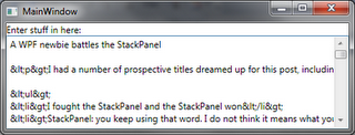
Grid row and column sizing., such as proportionally distributing available space between rows and columns. But for this example, the explanation above is close enough to correct.And now everything works as expected:
DockPanel will work here too. And he is quite right. The reason I’m using a Grid is I want to get StackPanel-like ability to stack any number of items. The example presented here is a simplified version of the problem I encountered which had 7 stacked controls, each containing 2 other stacked controls. For this case I used a DockPanel for the inner 2 controls, and a Grid for the 7 outer controls. The important thing here is that regardless of what container you choose, just make sure it’s not a StackPanel! ;)Conclusion
The StackPanel isn’t really evil; it’s just fairly useless for the layout I was trying to achieve. In fact, I’d go so far to say that in many (most?) cases it is pretty useless (how often will you want your controls to clip?).
From now on my default choice for stacked layouts will be a Grid with a single row or column. I find the cell assignments (Grid.Row="0") to be annoying noise, but at least I know my contents should generally resize sensibly.
Funny thing was that I had come across this months ago when first spiking a WPF application, but it took almost a day of battling the StackPanel again today before I remembered it. This time I’m blogging it to make sure it sticks! :)
Hope this spares you from experiencing the same pain. :)


